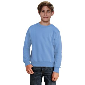
Fleece Sweatshirts: Color and Branding Ideas

In this guide
A coherent fleece collection starts with a limited palette, readable artwork, and a blank that works for the intended decoration. More colors do not automatically make a stronger collection. Consistency across sizes and repeat orders matters just as much.
Build a workable color palette
Choose a core neutral, a brand color, and an optional accent. Compare actual fabric samples under the same lighting; screen images are not a reliable color match. If matching multiple styles, check each style separately because different fabric blends may show the same named color differently.
Check contrast before production
Place the artwork on a photograph or physical sample of each garment color. Small lettering needs enough contrast to remain readable. A logo approved on cream fleece may need a different ink or thread color on brown or navy. Ask the decorator whether an underbase or other preparation changes the feel or cost.
Choose repeatable placements
- A chest mark works well when the design stays legible at a small size.
- A large front graphic needs room above a pouch pocket and away from seams.
- A sleeve detail should be checked against the available flat area on every size.
Keep a separate placement specification for youth and adult garments when their proportions differ.
Create an approval record
Save the blank style, garment color, artwork version, finished dimensions, decoration method, and approved sample photos. Include wash-test observations and care instructions. Before a reorder, confirm availability and compare a new sample to the approved one; a color name alone is not a production standard.